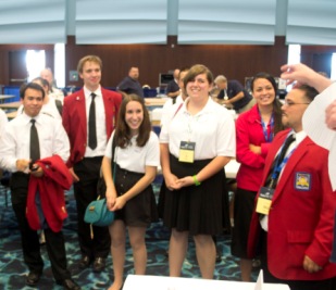
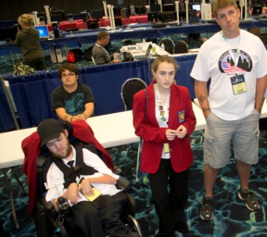
Thoughts from the 2011 National Web Design Contest Technical Committee
By Bill Cullifer, Executive Director WebProfessionals.org
Great contest this year!
Lots of very focused and motivated students and with a variety of skills ranging from the artistic, the technical and the budding entrepreneur participated in the National Web Design Contest this year. Many individuals and teams seemed to grasp all of these important concepts and Web design and development skills and this is a good thing. Hats off to all that participated and to the SkillsUSA organization for all that they do to support students in the U.S.A.
I’ve been giving a lot of thought to the contest and how it’s matured over the years. We’ve come along way since 2003, but we have lots more to do. For example, this contest sets the bar high for those that participate and that needs to continue and grow. I can only imagine how much of a challenge that must be for some students that lack the adequate training.
For example, students that have access to good schools, good curriculum and teachers seem to do quite well and it showed. Sadly, as we learned from asking the students the question, “does your school provide you with the resources to prepare you for this contest” many do not have that benefit. Lots of reasons for that of course and on behalf of the Web profession, we’ll continue to advocate for improvement and resources in this area.
Collectively, we need to do better in helping students prepare for a *very* competitive job market. Together, working with the help of the students and the teachers who teach them we can help educate decision makers within education and government to support Web design and Web development courses and pathways in schools.
I am thrilled to have spent time with such an amazing combination of students. The winning sites had great visual appeal and great code. The winning designs had pop visually and were complete with great branding and messaging resources. Additionally, many of the students that participated clearly understand the importance of Web standards that rational for designing with them in mind and this is also a great thing.
I’d like to take this opportunity to again congratulate the winners for a remarkable job well done!
Winning teams: Secondary
Gold: Team 9 Vermont
* Michael Angel
* Lorand Moore
Silver: Team 30 Utah
* Alarico Montoya
* Elleri Petersen
Bronze: Team 15 Massachusetts
* Jessica Kenney
* Stephen Asetta
Winners at the College/Postsecondary include
Gold: Team 504 Illinois
* Lisa Chester
* Sunny Okamoto
Silver: Team 512 North Carolina
* Garrett Dengler
* Andrew Taylor
Andrew and Garrett also walked away with first place for the Why HTML5 Challenge.
Bronze: Team 509 Kansas
* Thomas Ryan
* William Gates
On behalf of the WeBprofessionals.org organization and the Web design contest technical committee, I would also like to acknowledge the following teams for their spirit and enthusiasm.
Secondary
Team 5: Katie P and Amanda Z. from New Jersey
Team 27: Nathanael S and Christopher L from Arizona
Team 24: Michelle M and Brady M from Pennsylvania
Team 25: Austin C and Heather D. From Michigan
Team 26 Nicholas E and Peter H. from Illinois
Post Secondary
Team 503 Ricardo F. and Briaquel M from Florida
I wish you all of the best!
From Mark DuBois, WOW’s Director of Education
I wanted to take a moment and share my observations and include a few comments received from the judges. I am providing these hoping that we will continue to see gradual improvements in the competition every year.
First (and most importantly), I believe everyone competing at the contest demonstrated significant professionalism and enthusiasm. The contest is all about employing web standards, demonstrating professionalism and exhibiting a positive attitude. I observed these traits many times during the week.
Obviously, everyone participating had to win first place in their respective state competitions in order to participate in the national contest. The fact that you competed in Kansas City means you are a winner. We held separate contests for high school (secondary) students and college (post-secondary) students. Although both competitions had some similarities, there were a number of differences. Both competitions consisted of a series of 6 challenges (per competition). When all are combined, one would have many of the components of a working website.
Much of the contest is about professionalism. That is why we ask for copies of software licenses (operating system and applications – such as Adobe Creative Suite). This is also what we stress during the interview process. The following comments are meant to provide some feedback to participants (and to help those who plan to compete again next year). These notes are not comprehensive (only some of the common observations from judges). Obviously, a large part of this competition also focuses on adherence to web standards and established best practices in our industry.
First (and most importantly), focus on accessibility. This is important when choosing fonts and colors and when designing the structure of the site. Best practice is to include leveled headings and image descriptions (alternate text). Red/ green color schemes should be avoided as they will not appear as you think to those who are color blind. Similarly, one should stick with common sans-serif or serif fonts. Tightly spaced or script fonts can be difficult to read for those with poor eyesight.
Color schemes should support the type of website (for example, one would typically use a different set of colors for a bakery compared with a florist). Once you have a color scheme, it should be used consistently throughout the challenges (unless there is a specific reason to vary).
From a validation perspective, it might be easier to rely on the HTML5 doctype instead of XHTML 1.1 strict. The former is much more forgiving to the validator. Regardless of the doctype employed, don’t forget to include meta elements to help with search engine ranking (keywords and descriptions). When comments are included in the HTML and CSS code, they should be concise and provided to make the site easier to maintain. The purpose of each comment should also be evident.
If you design for a smaller screen size (such as a smartphone), don’t forget to use responsive web design techniques (perhaps percentages) to reduce the amount of horizontal scrolling.
Although not every team met the JavaScript challenge, everyone should understand these fundamentals. For those who were unable to complete this challenge, I recommend reviewing JavaScript fundamentals.
Lastly, there were some challenges with a title of “Untitled Document.” This should definitely be avoided.
Overall, many of the teams provided interesting approaches to each challenge. Many mentioned during their interview that lack of resources was actually helpful to their team (they could be much more creative). A number also mentioned that it would be helpful to have discussions with an actual client.
I appreciated all the feedback received during the debriefing and we will be making changes to this competition next year to reflect some of those comments. Overall, it was a great week and I hope everyone present enjoyed the competition as much as I did. Until next year…


